Each and every call to action on your website serves a specific purpose. You can use various call to action methods to make them more effective.
Here are the best call to action examples from top online companies you can use on your website to boost sales, signups and generally make the life of your website visitors easier.
1. Paypal: Letting users know what will happen
Paypal offers a neat CTA for users who want to learn a bit more about how the service operates. They decided to go for short introductory video that explains what’s what.
What’s interesting about this call to action example is the way Paypal let’s users know what will happen after pressing the button. Here's how the CTA looks like:
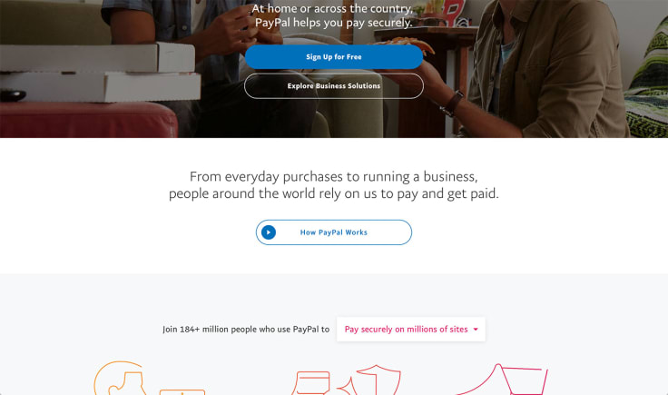
The addition of the small ‘play’ sign informs the visitor that the CTA opens up a video.
Letting your website visitors know what will happen after pressing a CTA makes the navigation on your website a lot easier. They can make more informed decisions how to proceed further down the funnel and don’t have to guess what they should do next.
2. Skype: Pointing to the more sticky option
Skype offers two similar CTAs to users who are about to access the app. They can either go for the web version of the application or choose to download a native app.
However, one of the options is more prominent than the other. The Skype team decided to make the download CTA more prominent by using a contrasting color, which looks way more engaging than the outlines CTA for the web app. Here's how it looks:
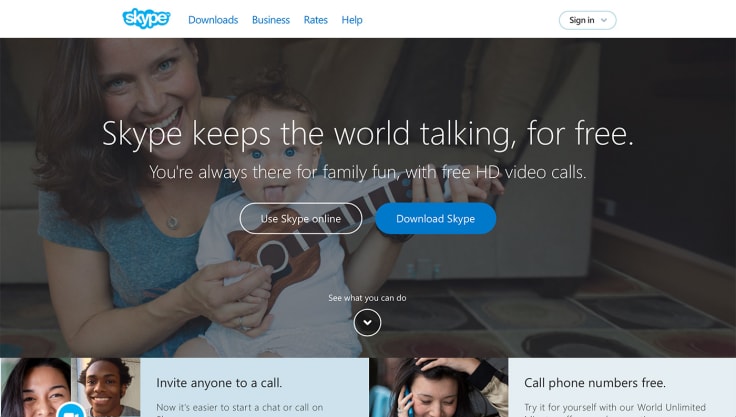
The reason for this distinction is product stickiness. Getting the app installed on a users machine is way more important for Skype than getting them to use the web app. Once the native desktop app is installed, it’s always available to the user. In the case of the web app, they would have to go to the app’s website every time they want to make a call. The easier it is to access the app, the more it will be used.
3. Grammarly: Very specific and dynamic CTA
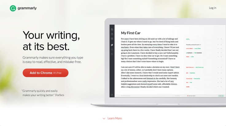
I think this is one of the best examples I managed to find. Here’s how it looks like:
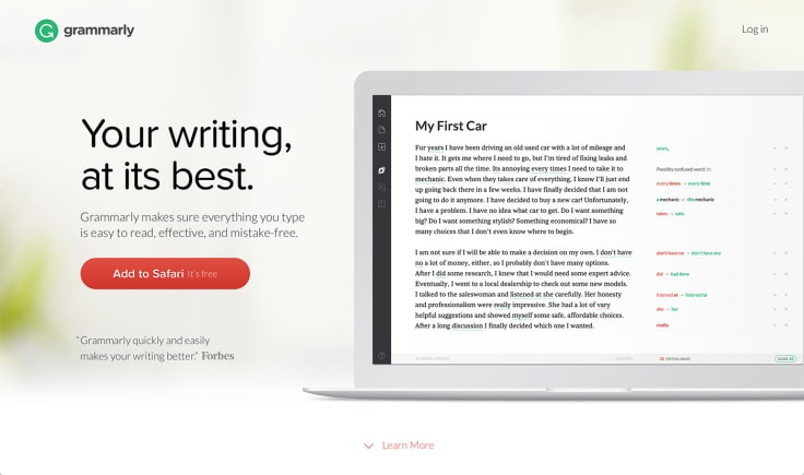
The Grammarly team managed to accomplish several tasks with only one CTA:
- they showed how it works (it's a browser plugin),
- they personalized the button (by showing which browser you're using),
- they made it really simple (just press to add and start using it),
- they showed that it’s free (further removing any restraints you might have).
Out of curiosity, I’ve tried accessing the same site from Chrome and I’ve got a similar CTA but this time it was telling me I should get Grammarly for Chrome. A nice touch that goes a really long way when it comes to the effectiveness of the button. If you have a way to make your CTA personalized like that, you should go for it!
4. Inbound.org: Header-CTA cooperation
The Inbound.org signup section is a nice example of complementing copy. The header refers to your own marketing growth and the CTA capitalizes on the same message.
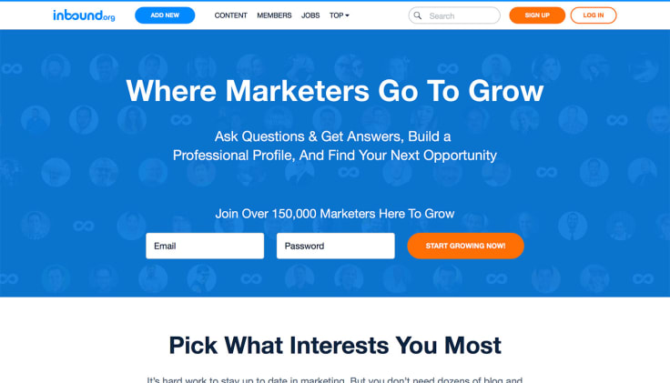
What’s also important, the CTA hints on immediacy, which is another popular method that can make your call to actions a bit stronger. You can usually add a modifier like ‘now’ or ‘today’ to push the visitor a little bit more towards action.
5: Hubspot: Even more complementing copy
A very similar example that’s been turned up to 11. Hubspot decided to make a very simple landing page for their grader tool. Users can provide their website address and email to get a website graded.
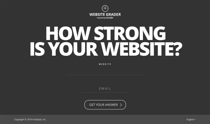
The CTA itself could be a simple ‘Try now’ but the Hubspot folks decided to go for something a lot more interesting. The CTA itself refers to the question asked in the header and plays up to the curiosity off the reader and tries to capitalize on it. A perfect way to get them interested in the tool.
6. Basecamp: A CTA that’s not really a CTA
This is one of the more unorthodox examples I’ve found. Basecamp offers a quick signup for on their website. What I initially thought was a CTA turned out to be a header, with a proper CTA below the form.
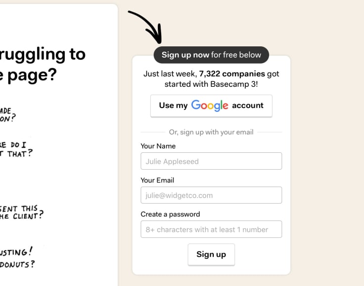
The shape and color of the header suggest that it’s a clickable button. Since we are really good at spotting patterns, we will automatically notice the button-looking header and will pay attention to the form.
If the same-looking button was placed below the form, we would need spot it first and then read what the form is about. By placing it up top, we started paying attention to the form in a more natural top-down order. And since there is a neat social proof added just below the CTA-looking header, it’s worth it to ‘trick’ the visitor a bit to get them to see the full story in return.
7. Adobe: Upselling while keeping the hierarchy
There’s a ton of different ways you can engage your website visitors and get them to buy or sign up. The problem is, the more methods you use, the higher chance that you will complicate your website flow.
To get around that, you need to pay attention to the hierarchy of information on your website. And more importantly, the hierarchy of your CTAs.
Adobe is a nice example of how you can have multiple CTAs not competing with each other. When presenting their pricing for their Creative Cloud, they offer a simple ‘Buy’ option and also use an upselling CTA as well.
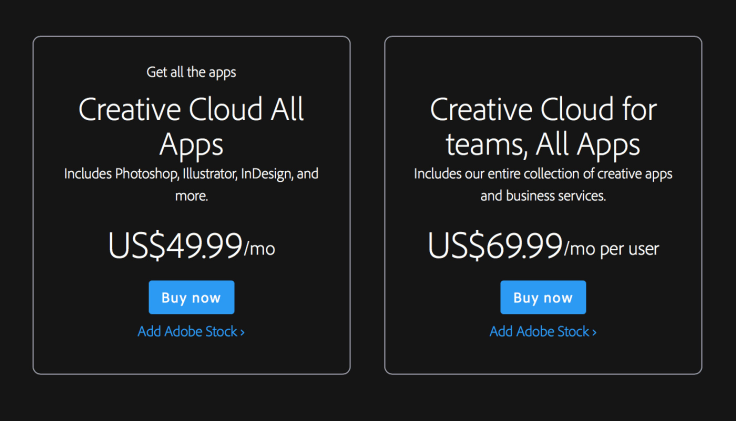
This way, users move further down the funnel through the prominent ‘Buy’ CTA and learn about the stock option as well.
8. TripAdvisor: Specific CTAs and CTA graphic
TripAdvisor is another good example of a website with a very clear CTA:

You instantly know what the search bar is about once you take a glance at the CTA. A ‘Search now’ button would force the user to look for other means of identifying what they can do with this page element, making the search process harder and longer.
Another interesting example of a CTA is the ‘Find your flight’ button. It’s a part of the larger graphic that can be clicked to look for flights.
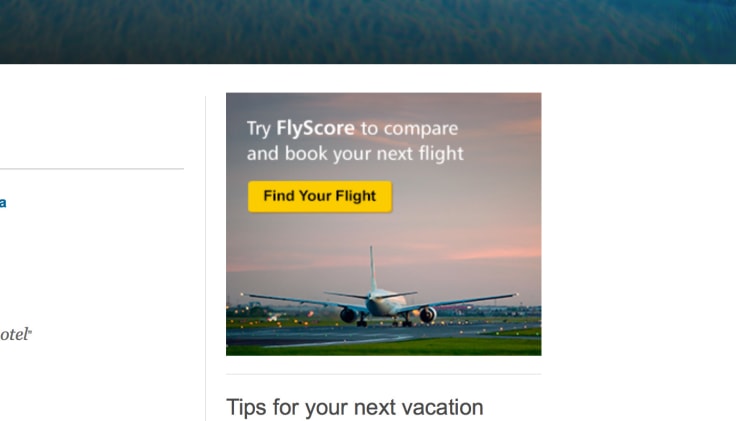
The TripAdvisor team went for the similar button shape to signify that it’s a CTA, similar to the way how Basecamp did it in example 6. Just imagine how would the CTA look like if the ‘Find a flight’ sign wasn’t a button. It would quickly change from a CTA to a yet another graphic in the eyes of website visitors.
9.Amazon: Placing an emphasis on security
It’s one of the simpler call to action examples but it shows how you can give a lot of different reasons for visitors to get interested in your CTA.
Since Amazon handles a lot of credit card information of its users, they decided to put the emphasis on security in their main CTA.

My guess is they use customer segmentation to get a good idea about their users doubts and want to address the main one with the CTA. They also communicate value in this way. With other similar sites offering a simple ‘Sign up’, it looks like all those competing websites don’t provide a secure connection.
10. GoDaddy: Answering the needs of customers
People coming to your website will want to solve a particular problem. They may need a new pair of shoes or want an easier way of handling their taxes.
In the case of GoDaddy, people coming to their website need domains. By reflecting that need in their CTAs, GoDaddy can convert website visitors into customers easily.
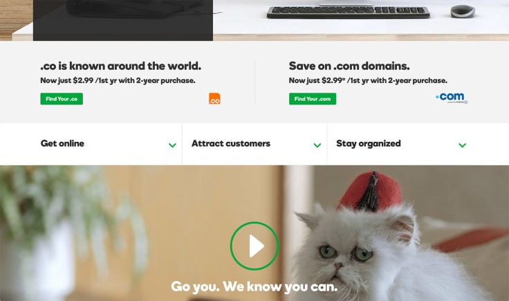
The very specific ‘Get your .co’ call to action is perfect for that. People will instantly recognize the .co domain, and know what the CTA is about.
Apart from that, the less-prominent drop-downs were also prepared with the same idea in mind. Each dropdown answers a specific need a customer coming to the website might have.
There’s also the cat. It definitely makes the otherwise bland play button a lot more interesting.
11. Desk.com: Dealing away with inhibitions
CTAs are a lot like a tug of war competition. If you think of all the methods and ways to make your CTAs more appealing as one team, the other would be all those things that drive visitors from clicking.
One of such things is doubt. Users can be unsure or worried about a particular aspect of a product. For example, the price. One, very popular way of dealing away with such doubts is adding an information that something can be tried out for free.
It’s very common for online SaaS businesses to add such an information to their trial sign up CTAs.
In this example, Salesforce.com, a popular help desk provider offers such a CTA to get people to try out their free trial.
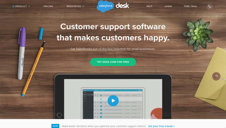
Usually, you can also add information about the trial length to make it even more appealing, for example:
12. Google Sheets: Making decisions easier
When browsing through the Google Sheets product page (awesome service by the way), I found an interesting solution to the multiple-app problem.
The problem is: how do you display CTAs if you have multiple apps. Usually, app services providers will list several apps, each for a different platform in a row.
The Google Sheets team came up with an idea to hide the apps under a drop down:
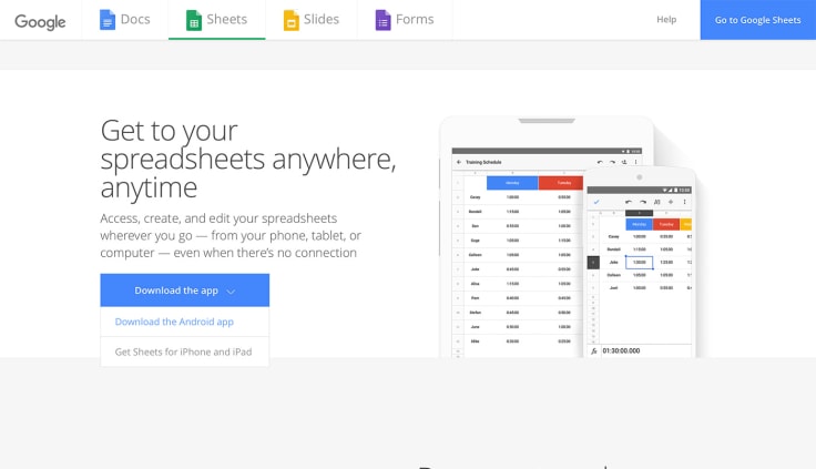
This is neat because you no longer have to think which app you want to get. By removing that part from the equation, the user only needs to decide if they want to download an app. Once that decision is made, picking a specific app shouldn’t pose a big problem.
13. Google AdWords: A consistent choice
Another Google product and another good call to action example. This one is all about consistency.
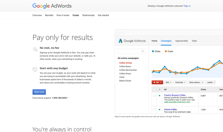
The more different takes, on the same CTA you offer, the more questions a user has. If you have three different CTAs leading to the same place, each one of them has to be understood by the visitor.
To make things a bit simpler, the team responsible for the Google AdWords page decided to use the same CTA on the entire website. Instead of creating unnecessary questions by adding different CTAs, they went with a simple ‘Start now’.
14. Dropbox: Facilitating immediate action
The CTA for the Dropbox mobile application removes a few actions a user would have to take to get the app:
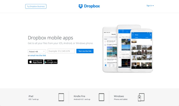
By providing their mobile phone number and clicking on the CTA, Dropbox users can get immediate access to the mobile app. This would normally require a couple more steps. Thanks to the added element of immediacy, this CTA is really powerful.
There’s also a smaller CTA for people preferring to get the same app via email. The alternative is nice, considering that it can be used to ‘save’ the link to the app for later.
15. Dropbox Business: CTA for qualified users
Another example from Dropbox. This one is about their Dropbox Business product. On the pricing page, there are two types of CTAs available. The first two are about starting a trial of the product. This is probably how most users start their experience with Dropbox.

In the case of the business plan, there’s also a smaller CTA that allows users to make a purchase immediately. In the case of very qualified users, this makes sense because they’ve probably already tested it our or know the benefits of the service.
Offering a CTA that recognizes that and moving straight to business allows qualified customers to save time by making an immediate purchase.
What are your favorite call to action examples
Know of any interesting call to action examples? Make sure to share in the comment section.
Just think about the last call to action you clicked and why you did it. That’s probably a pretty good example!

